Best of Forced Perspective
- Jenelle Flores
- Oct 10, 2024
- 1 min read

For this critique blog, I chose to take a look at Cristina's pictures and distinguish one of her pictures that I thought was the best and one that could use some improvement.
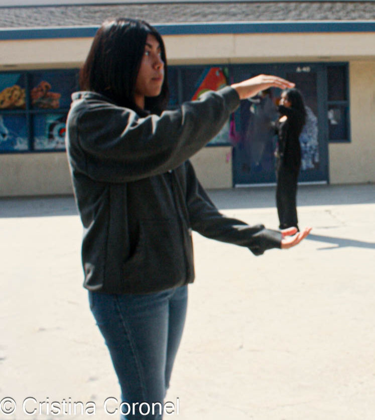
Her first picture stands out as it has sharp focus, well-balanced lighting, and good composition. Her subject is clearly defined, and the use of space draws attention to the main elements without feeling cluttered.
She also did a great job with her lighting, which highlights the subject well. The focus is sharp, making the subject clear and easy to see, while the background is blurred just enough to keep the attention on the main subject. The composition of her picture is balanced, and the colors are vibrant, adding to the overall appeal of the image. However, to make this great picture even better she can tweak the lighting a little bit to add a touch of drama and dimension. Overall I believe that her picture does a great job of showing forced perspective.

Her second picture is also amazing but it can have some improvements to become even better. One thing that she can do next time is fix the lighting so that it doesn't seem a little dim, making the details hard to see. If she was to reshoot this picture she could use softer lighting to make the image more vibrant and clear. She can also adjust the angle so that the subject is centered or placed according to the rule of thirds which would improve the overall balance of the picture.
Overall, Cristina's pictures were amazing and showed a great example of forced perspective.


Comments